
Big data visualization
This project is a bit hard to explain it's a huge 7 petabyte a day dashboard for MS internal team. I can't show everything but just a few slides showing how I designed this site I also created the brand and logo for this very exciting dashboard design.


Completely new data visualization method
User problem/objective
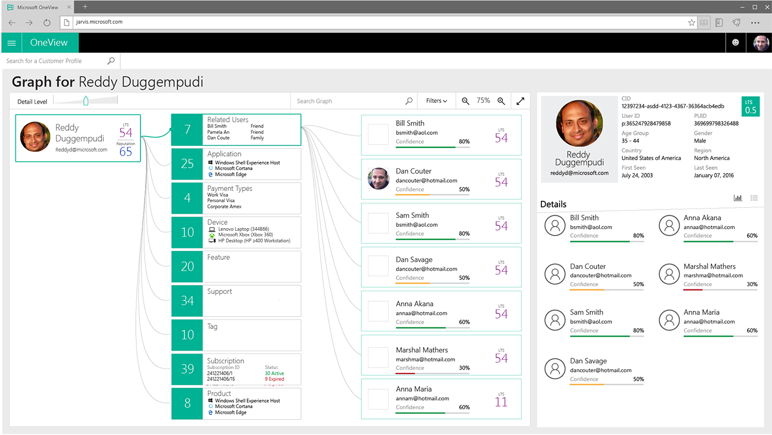
Being a brand new project I had full design freedom for this project. What your seeing here are some big data visualization samples that I proposed to management. They were looking for an elegant way to expose particular users and their purchasing power within any specific organization to expose the connection and frequency of use of all Microsoft apps all over the world.
My personal course of action
This project was interesting since there was not a clearly defined set of how the data could be delivered and into what format. So that not being clear this was an exercise as to what could possibly be. So my main goal was to demonstrate and prototype completely new and the most innovative data visualization models I could imagine. Working with two other Jr. Designers we created and presented many different forms of visualization.
Results/project outcome
Unfortunately this project was entirely experimental and thus the work I did was well received but never implemented. I believe the overall project was very underfunded and understaffed.